
End-to-end Product Design
Hill Robinson's Team hub
Redesigning Hill Robinson's digital workplace to boost usability, engagement, and access to key resources - leading to a 37% increase in monthly users and a 36% rise in traffic to the most visited content within the first month after launch.
Topics:
Data-driven design iteration, Project planning and execution, Cross-functional team coordination

Hill Robinson hired me to take over a stalled digital workplace redesign project that had been on hold for nearly a year. Tasked with delivering 8 interconnected sites, I not only conducted research and designed the UX and UI but also managed the project, overseeing 5 teams of content creators and ensuring the seamless integration of content. This was a pivotal challenge in my career, where I applied both my UX and project management skills to ensure a successful delivery.
A critical aspect of the project was the usability study I conducted ahead of the launch. The feedback led to several key design adjustments that significantly improved the user experience. The results were quickly measurable: within the first month of launch, monthly intranet users increased by 37% — from 293 to 401 — and engagement with top content rose significantly, with the 10 most visited pages seeing a 36% boost in unique viewers. This case study highlights how usability testing directly informed key design decisions that drove this improvement and contributed to the project’s overall success.

Table of contents
DETAILS
RESEARCH PLAN
Methodology
Testing format: Remote moderated testing.
Testing platform: Microsoft Teams.
Participants: Seven participants from various departments with different seniority levels and varying degrees of engagement with the current platform.
Why? It allowed us to observe real users performing key tasks in a controlled environment, revealing pain points, navigation issues, and content findability challenges that could create adoption barriers post-launch.
Research goals
-
Assessing how users think, feel and behave while interacting with the new intranet environment.
-
Determining the elements of the intranet that are difficult to use or unappealing.
-
Understanding how efficiently users can access the assets and information that the business provides.
Key performance indicators (KPIs)
-
Task success rates.
-
Time taken to complete tasks.
-
Number of errors.
-
Points of confusion.
-
User satisfaction (measured through qualitative feedback).
Research questions
-
Are there any parts of the user flows where participants get stuck?
-
Do participants find the intranet appealing and/or easy to use?
-
Are there any design changes that can improve the user experience of the intranet?
-
Do users find that the intranet content and its new layout are helpful and/or useful?
-
Can users identify any issues that would prevent them from using this resource?
What areas did we test?

Training requests
News & company announcements
IT support
Templates & marketing assets
Human Resources key information
Townhall repository
Successful tasks
Four out of six tasks scored very high success rates and positive responses.

Reading the latest company news
Task success rate: 100%
Average time on task: 32s
Error rate: 0%
Points of confusion: 2
User feedback: All 7 users thought finding news content was easy, clear and straightforward.

Downloading a template
Task success rate: 100%
Average time on task: 1m 34s
Error rate: 0%
Points of confusion: 1 (how to download the page)
User feedback: All users described the process of finding the template as “easy” and managed to save a copy of the template, but all experienced some minor struggles downloading it. This was fixed by adding a brief message to the design on how to download the template.

Getting support for an IT problem
Task success rate: 100%
Average time on task: 43s
Error rate: 0%
Points of confusion: 3
User feedback: 6/7 users found that the process of finding and requesting help was easy, straightforward and self-explanatory.

Requesting personalised training
Task success rate: 85%
Average time on task: 1m 25s
Error rate: 14%
Points of confusion: 2
User feedback: 6/7 users successfully completed this task, with 5 of them doing it in under 1 minute. Most users declared that the process of requesting training was “nice”, “clear” and “straightforward”.
Challenges
1. Finding a past Town Hall recording
Task success rate: 43%
Average time on task: 1m 25s
Error rate: 85% (Percentage of users who made at least 1 error)
Points of confusion: 9
Users were asked to locate past recordings of the company’s monthly Town Halls. Most found the task unintuitive, as the site structure didn’t align with their expectations.
Key points of confusion
-
Misaligned expectations: 6 out of 7 users looked for the recordings in the News section, but they were actually housed under a site called Our team.
-
Unclear navigation labelling: The name Our team suggested content about departments or individuals. Three users said they wouldn’t expect company-wide updates to live there.
Solutions
1. Increase the number of access points to the Town Hall repository and improve their strategic placement


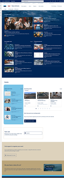

Observing how users overwhelmingly chose News & Events as the destination to find the recordings, we added a direct link from the site's landing page to the repository.
News & Events site

2. Finding key information about the user's leave rights
Task success rate: 43%
Average time on task: 2m 41s
Error rate: 100% (All users made at least 1 error while carrying out this task)
Points of confusion: 20
Users were asked to find information on leave and absence options. While the details were in the Company Handbook, a crucial document for the business, 4 out of 7 users couldn't find them, and all users faced challenges.
Key points of confusion
-
Unclear location: The Handbook wasn’t an obvious go-to. Only one user looked there first; the rest turned to Policies & Procedures (3 users) or their third-party HR provider (3 users). The Handbook lacked clear pathways to guide users to the right content.
-
Content overload: Three users found the Handbook too dense, saying its length and complexity made it an unappealing resource.
Solutions
1. Increase discoverability of content in the Company Handbook


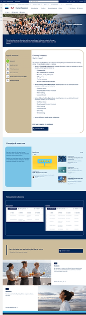
Human resources landing page
In the first re-design, the Company Handbook was part of a list of useful resources at the top of the site, but it did not give users enough information about what to use it for

Additionally
Most users went to the Policies & Procedures section as their first or second option. To assist them, we added a prominent link near the top of the page to guide them to the Handbook in case it contains the information they need.

2. Incorporate a clickable content table to the Company Handbook
Users who accessed the Company Handbook expressed frustration over the overwhelming amount of content, making navigation difficult and tedious. Many found themselves discouraged and mentioned they might abandon their search before finding the necessary information.
To address these issues, I made two time-sensitive recommendations:
-
First, to meet our launch date, I proposed adding a clickable table of contents at the top of the page. This would allow users to:
-
Understand the guide's structure and the content in each section
-
Quickly navigate to the information they need
-
-
Second, as a post-launch initiative, I recommended conducting further UX research to understand when and why users visit this area of the intranet, as well as their priorities and preferred formats. Since the Company Handbook contains valuable information, it is crucial to ensure it is easily visible and accessible throughout the intranet while making its content user-friendly.
POST-LAUNCH RESULTS
10/11/2024

-
Unique viewers in the last 30 days: 293
-
Unique viewers of the 10 most visited sites in the last 7 days: 447
07/05/2025 (5 WEEKS AFTER LAUNCH)

-
Unique viewers in the last 30 days: 401
-
Unique viewers of the 10 most visited sites in the last 7 days: 608
-
The numbers reflect a 37% increase in monthly users and a 36% rise in traffic to the most visited content.
-
Selected sites like Human Resources (previously People) and Wellbeing saw an increase of 100% in use in its first five weeks live.

Overall perception
The overall perception of the new design (6/7 users) was that it as “cleaner”, “clearer”, “consistent” and more “put-together”.
User feedback
“Easy, flowy. Simple, and no fuss. [...] It's simple. I quite like the simplicity of it. [… ]It looks cleaner. [...] It feels visually more resting [...] On the previous one, there was a lot of folders and you had to go into the folders to go and get the stuff and then it didn't feel. It it felt less airy. This feels more airy. […] ”
“I think it's a lot easier to navigate. It's a bit clearer in the way things are laid out, […] to me this just seems more accessible than the previous one.”
“It looks like it’s going to be a lot better. It’s going to be easier to find things that you want and looks like there’s a lot more there. And yeah, it looks great”
CONCLUSIONS
This project was a turning point in my career—not only in terms of scale, but also in the depth of responsibility I carried across UX, research, and project management. The usability test proved invaluable in refining the final experience, resulting in a 37% increase in monthly users and a 36% rise in traffic to key content. Feedback from participants reinforced the impact of the design, with the majority describing it as “cleaner,” “clearer,” and more “put-together.”
I continued working with Hill Robinson for four additional months post-launch, supporting adoption, leading training sessions for content owners, and ensuring the long-term sustainability of the platform. This case solidified my belief that successful design doesn’t end at delivery—it extends into adoption, empowerment, and measurable outcomes.
