

UX/UI Redesign
Spotlight News
Redesigning a global and local news site experience for a multimedia powerhouse resulted in a 101% increase in engagement during its first four weeks live.
Topics: UX Research, Heuristics evaluation, Wireframes, Prototypes, Stakeholder management, Information architecture, Accessibility improvements, Fluent UI


One of my closest clients, a multinational, award-winning film and television production company, needed to integrate local news content into their global internal News Centre.
Following our advise, they chose to use this opportunity to improve the overall user experience of the site.
My role was to design a way to visualise local and global news content in the News Centre, driving engagement and better reflecting the company's creative and impactful brand identity.
By applying user research, iterative prototyping, and the Fluent UI design system, I delivered a solution that improved content discoverability and user engagement, ultimately providing a more streamlined and efficient way for employees to stay informed.
To avoid breaching confidentiality clauses, I will not disclose the name of the company in this case study.

TABLE OF CONTENTS
DETAILS
The project
My role: UX Consultancy, UX Design, UX Research
When: March 2024 - July 2024
Where: London
The client
Size: 6000 empoyees
Locations: 27 countries
Beliefs: "Our future is reliant on our creativity."
Brand identity: "Progressive, Ambitous, Agile, Creative, Global, Family"
Goal
Helping my client reach their employees worldwide with impactful, engaging stories, aiming to become a global, connected, creative family.
Tools
Figma
Miro
Canva
Microsoft 365
APPROACH
UI DESIGN
HI-FI PROTOTYPING

User research

Design Evaluation

Synthesis

Iteration 1

Iteration 2
GENERATIVE + EVALUATIVE RESEARCH
INFORMATION ARCHITECTURE
WIREFRAMING
MID-FIDELITY PROTOTYPING


USER RESEARCH
Overview
The users participating in this survey were professionals from a selection of geographical regions and departments within the company.
To accommodate availability constraints and time differences, we opted to use qualitative surveys as a means of gathering the necessary information for the initial phase of the project.
We used empathy mapping to systematise our approach to analysing their motivations.
Survey regional groups
Spain, Indonesia, USA, UK, Netherlands, Italy, Australia.
Methods & Methodology
Primary research.
Qualitative surveys, empathy mapping.
Sample survey questions
-
What kind of information do you usually need to share with your region?
-
How do you currently share and consume news from the company globally and locally?
-
How do you currently consume important announcements from the company globally and locally?
-
Can you describe any communities or social initiatives in your office that would benefit from having a digital platform?
-
What would you change about how you share and consume internal news and communications in your day-to-day?
Key takeaways
Users' priorities
-
Local news content needs to be visible exclusively to users from their own territory.
-
The News Centre should provide an alternative to email communication where appropriate. News articles should reduce the volume of email announcements shared by the company, therefore needing to be accessible and easily discoverable.
-
The News Centre should be easy to navigate.
-
The News Centre needs to be integrated with the rest of their company resources.
-
It should be immediately clear whether a news article is local or global.
-
It should provide content in a variety of different media. They would like to see content that caters to the needs of different users.
DESIGN EVALUATION
I approached the design evaluation by putting myself in the user’s shoes and giving myself a common scenario in the context of the company and a task to complete.
This would be the user’s journey to complete the task (with my thoughts and comments in sequential order):
Task
Look for information about the latest company acquisition of a film production label that everyone is talking about
Action flow
Comments
There are two news sections in the landing page and I’m not sure of what is different between them. They each have a link saying see more news, which adds to the confusion of where to click next
INTRANET HOME PAGE
NAVIGATION MENU
NEWS CENTRE HOME PAGE
NEWS CATEGORY PAGE (CORPORATE NEWS)
1. Which link should I press?

It was not immediately obvious to me which of the categories in the navigation would have the information I was looking for
2. Which category is it?
The site’s landing page adds no additional information about the categories to solve my doubts and the repetitive imagery makes it even harder to tell them apart
3. Which category is it (again)?
There are no sections in the category page, so I didn´t immediately know where to look
5. No context
4. Link overload
The link cluster with small images and no categorisation increases cognitive load
Site analytics
Bounce rate - 20%

Unique visitors - 1918
Only 1/3 of the ~6000 employees of the company visited the site in the last 30 days

Page load time - 1s
We discarded page load time as a reason for low engagement
The number of unique views per category page is extremely low and does not correspond to the number of unique viewers per news article, which indicates that users don´t go to the News Centre to find news, but rather get there from other pages that display news in the platform (like the intranet landing page seen before).

Unique viewers: category pages
Unique viewers: news articles

Heuristics + Accessibility evaluation
This table shows a part of the list of issues to be addressed using the MOSCOW prioritisation method.
I measured the usability success of the site against Nielsen’s usability heuristics for interactive design and also assessed it against WCAG 2.1 for accessibility.
SYNTHESIS
-
A simplified navigation
-
A landing page that provides users with the latest highlights and clearly signposts news categories, with a special emphasis on local content
-
A design that protects the privacy of local news
-
Site pages that support multimedia content to cater to diverse populations and reflect the company's creativity
-
UI design that enhances the visual impact of the news content, making it bolder and more appealing
-
Inefficient and difficult information architecture.
-
Overwhelming, link-heavy layouts.
-
Lack of alignment to the company’s brand and values.
-
Neglected news categories with minimum engagement.
-
Local news should be prominent, but not visible to the whole company.
In this iteration, we focused on the most pressing usability and accessibility concerns uncovered by our research and design evaluation. We prioritised designing a more intuitive and logical information architecture and news page layouts that presented the needed content in a structured and engaging way.
We validated these designs in their mid-fidelity versions with user input.
Iteration 2
Challenges
Iteration 1
Solutions
In the second iteration, we reviewed the overall research and applied what we learnt from the feedback on the mid-fi prototype to continue improving the experience, incorporating at this stage the look and feel of the brand.
ITERATION 1
Information Architecture
Methodology
Card sorting workshop
Participants
13
We held a card sorting workshop with the relevant stakeholders to find a more organic and simplified way of structuring the content and information categories to be included in the new site.
IA Areas
Content


Local content was analysed in further detail to define the needed information areas within each of the region's pages.
Content
After the workshops, the News Centre navigation tree was created to capture the information architecture to be used in the new solution.

Wireframes
I used Crazy 8s to get some ideas on the table and discuss them with the team before committing to more developed versions of the site pages.

Example of the team's feedback on the Drama & Film page
-
Trailers displayed in a big way make the content more visually engaging.
-
This page is about enjoying the company’s productions - it should be striking.It makes sense to divide the content a little bit further to point the user in the direction of the news they are after.
-
Add video straight to the page - the multimedia content should be accessible in one click.

Mid-fidelity & user feedback
I created mid-fidelity screens to collect user feedback on the layout and content of the site pages; you can see some of the comments below.
1. Audio content
This page should include a section for audio content

2. Category links
It would be great to be able to navigate between category pages with in-page links as well as with the navigation
3. Unclear interactions with user stories
An indication of how to engage would help

5. More context
Certain sections could benefit from including an introduction
4. Confusing section
Users are not clear on what they will find in these links and find the layout unclear
ITERATION 2
HIGH-FIDELITY MOCKUPS & PROTOTYPES
Recap of priorities
-
Should reduce the number of content areas
-
Local news content needs to be visible exclusively to users from their own territory
-
Should be available in different media
-
Should represent the brand
-
Should be easy to navigate, with clear information about sections and content

LANDING PAGE
AFTER

As the first point of contact with the site, we wanted the landing page to be impactful, showcasing visual samples of the content that users would find in each category page. As captured in previous research, the company's users are creative professionals who value the visual aspects of a site, so it needed to be aesthetically compelling.
The local content section of the page is configured to be audience targeted, which means that users of a particular country will only see content from their country represented there. Each news post also presents a label signalling whether the content is global or local.

BEFORE
COMPANY NEWS
BEFORE
AFTER

Corporate News

Our company in the press


To simplify the information architecture of the site, we merged Organisational Announcements, Corporate news and Our company in the press under Company News. We also used this opportunity to include audio and video content as highlighted in our feedback session with the stakeholders. Including podcasts and interviews with the leadership was aimed at making this the place of reference for strategical updates and to provide a diversity of formats to reach a wider population.
Organisational announcements
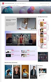
AWARDS
BEFORE
AFTER

Awards was a particularly important page for the company, since it highlights their commitment to quality and the diversity of their productions. It is also an opportunity to celebrate the talent of the professionals making these productions possible, so I tried to emphasise the value of their merits with awards-related, human-centric stories.

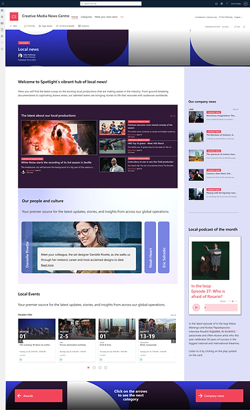
LOCAL NEWS
The addition of Local content to the News centre was at the origin of this project, so we were particularly keen on getting this side of the project right. During the research phase, we engaged with many new stakeholders who had not been part of this project before, so ensuring that their needs were reflected in the design was the key to providing a smooth onboarding that ensured the subsequent growth of the project.
IMPACT EVALUATION
The site went live on the 24th of July 2024. During the first three weeks live, we could observe an increase of 101% in site visits, going from 232 site visits on the 24th of July to 1591 on the 7th of August. No correlating event was found to explain this increase aside from the new site experience.
CONCLUSION
This project was an exciting and rewarding challenge for me, as I had the opportunity to exceed the expectations of the client by re-designing their whole News experience, meeting their needs with regards to their regional objectives while collecting excellent results for the new design overall. I feel like it was a fantastic way of vindicating the value of UX for their processes and it allowed me to offer my subsequent recommendations with the confidence offered by data.
My client was very cautious to include wider populations in our research studies, but through building our relationship and offering good results we managed to get them to recognise the potential benefits of carrying out post-launch research with a varied sample of users in order to identify the potential areas of development, focusing both on how to build loyalty and keep users engaged so that the curve would not decay after an initial good start, and capture the attention of new users.